GET A FREE CONSULTATION


Posted by Sanket Patel
November 25, 2016
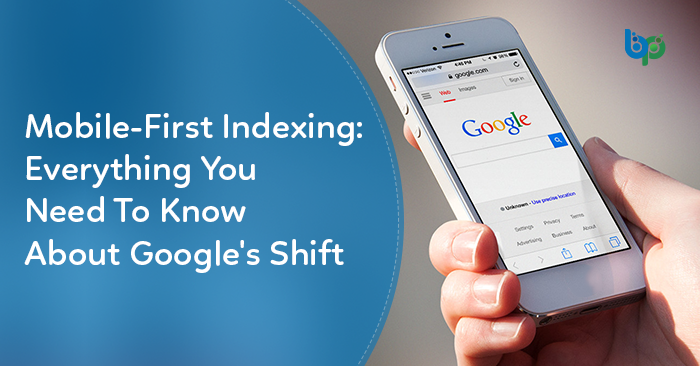
Big Change: Google’s Move To Prioritize Mobile Search Index Over Desktop. How Will It Affect Search Rankings? What To Do To Be Prepared?
Today, most of the people are using Google search on their mobile devices. However, Google ranks the websites on the desktop version of a page’s content evaluating it’s relevance to the users.

This can cause issues if the mobile page has less content than the desktop page because search engine algorithms will analyze the page which is seen by the mobile searcher. So, it makes sense to switch from desktop search to mobile search indexing.
The idea of splitting the search results was heard about a year ago, but Google has now posted the official details about mobile-first index on their own webmasters blog.
Google has begun experiments to make mobile-first search indexing, which will primarily focus on the mobile version of your web pages than the desktop version if there’s no mobile version.
Since Google’s Webmaster Trends Analyst Gary Illyes announced last month that Google is switching to mobile-first index, there has been lots of conjecture, panic, rampant speculation and buzz about what does it exactly mean.
Currently, Google has only one indexing system which is based on desktop websites. When the user searches something in Google, the spider bots look at the desktop index created by the Googlebot crawlers. Then, it finds relevant results based on the desktop index and ranks them based on the desktop version of the site. Further, the Ranker then look at the mobile signals like a responsive site and these details are collected by the mobile crawler to adjust the rankings accordingly.
This process has caused some issues. Many times, the user finds something in the snippet, clicks the results, gets redirected to the mobile’s index page which will probably spawn an app store and then realize that the content they saw in the search snippet isn’t available on the stripped down mobile version of the site. This is where most websites fall to deliver good user experience.
With Google’s shift to mobile-first indexing, they’re looking to fix this issue. The basic theory says that content is not much important to be on your mobile site, then maybe you are not the most relevant result for that content.
Ever since Google has announced this change, there have been many conversations and blog posts which are all focusing on just Ranking. While it’s true that mobile search indexing will affect ranking, you should step back and first consider indexing if you truly want to be prepared for this change.
When it comes to mobile-first index, there are generally three scenarios: either a website is responsive, has a separate mobile site or doesn’t have a mobile site at all. Let’s dig deeper in all the three scenarios.
Nothing much is expected to change with regards to indexing. There are some issues which include things like drop-down menus or changing the weights for tabbed content which are mostly less valued on desktop but shouldn’t be devalued in mobile.
Here’s where the things get a bit tricky. If a website has canonical or rel=alternate tags OR device type redirects set up, the mobile crawlers will crawl the mobile site only not the desktop version. This means, if some content is only on the desktop site, mobile Googlebots will not see it and it won’t be considered in the mobile-first index. Though Google is on it’s way to solve this issue, many publishers also face this issue.
The last scenario is concerned to the pages which don’t have a mobile site. There are still tons of those pages out there. The mobile crawler will not only crawl the mobile friendly pages, it crawls everything. So, the mobile Googlebot will still see these pages. Surely, they won’t rank for their mobile friendly sites, but they’re alreasy not ranking as well as mobile friendly sites. This will not change after mobile-first indexing.
Basically, the pages which have a mobile version but do not include the same content as the desktop version will be affected by this change. However, the pages with only the desktop version would still rank. Yes, it would just look ugly on mobile phones. That’s the main and important difference. So, what we should look at is the content that’s on the desktop pages but not on the mobile version.
Here are some recommendations from Google webmasters to prepare for the change:
1. If you have a responsive site or a dynamic serving site where the primary content and markup is equivalent across mobile and desktop, you shouldn’t have to change anything.
2. If you have a site configuration where the primary content and markup is different across mobile and desktop, you should consider making some changes to your site.
Make sure to serve structured markup for both the desktop and mobile version. Sites can verify the equivalence of their structured markup across desktop and mobile by typing the URLs of both versions into the Structured Data Testing Tool and comparing the output.
– When adding structured data to a mobile site, avoid adding large amounts of markup that isn’t relevant to the specific information content of each document.
– Use the robots.txt testing tool to verify that your mobile version is accessible to Googlebot.
– Sites do not have to make changes to their canonical links; we’ll continue to use these links as guides to serve the appropriate results to a user searching on desktop or mobile.
3. If you are a site owner who has only verified your desktop site in Search Console, please add and verify your mobile version.
Are these questions popping up in your mind
For the beginners, get rid of all those device type redirects from sub-pages to the mobile homepage. Nobody likes those. If you don’t have a mobile version of the page, just serve mobile users the desktop pages you have. It’s actually a better user experience if they get the content they want in an ugly format than having a pretty page which is not relevant to what they’re looking for. Better yet, create a mobile version of the page!

Probably not. Google has mentioned that it’s likely that they’ll be smart enough to handle them on their own – as asking Webmasters to change them all would basically never happen.
Have you started thinking about micro-formats. Still, many SEOs haven’t added these to their mobile sites. Make sure you’re using your schema and hreflang on all your pages.
Stay Tuned For More Updates
As we see more updates or changes to the Google index and results, we’ll be reporting back to our readers with latest buzz on mobile-first indexing. We’ll let you all know when this big change fully rolls out.
